Signage, at its best, has the power to grab attention immediately, convey a brand message, and even set the tone for what’s in store on the interior of a business. The capabilities of signage and what it can achieve when executed correctly is an important part of the branding process.
Signage and branding often go hand-in-hand. While some don’t take advantage of exterior signage, these companies did. The following examples stand out for their unique qualities of showcasing their brands through innovative signage. Additionally, all of these examples utilize Dibond aluminum composite material.
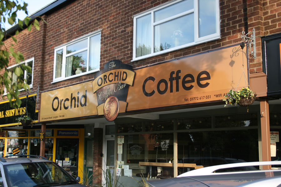
Orchid Coffee Bar- by Dave McDonald of Poppy Signs
Styled in simple sans serif typography and tinted a delicious color of lightly brewed coffee, this store sign gives a modern twist on the traditional coffee shop. The sign uses a durable Dibond backing with a customized center cut out to communicate an inviting new coffee shop in the neighborhood. The durable signage will maintain a polished finish in any weather condition because of the Dibond material.
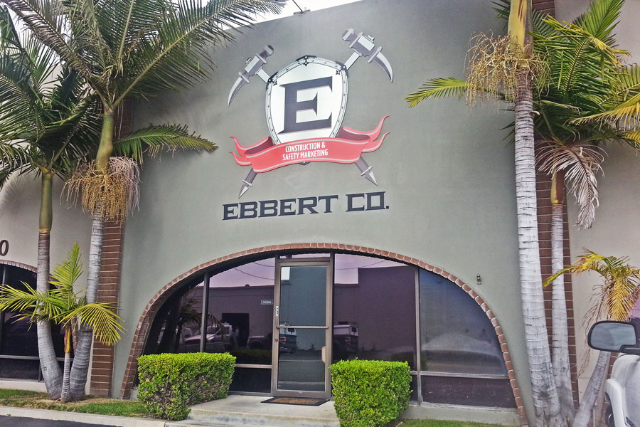
Ebbert Construction Company- by Big City Signs
A tough exterior signage is perfect for a construction company. This signage exudes strong and tough qualities of a company that builds for a living. The large silver shield with the companies initial and metal pics arranged in an “X” shape make a statement right away. It’s a bit unexpected and yet, perfect for the hard-hat wearing company it represents.
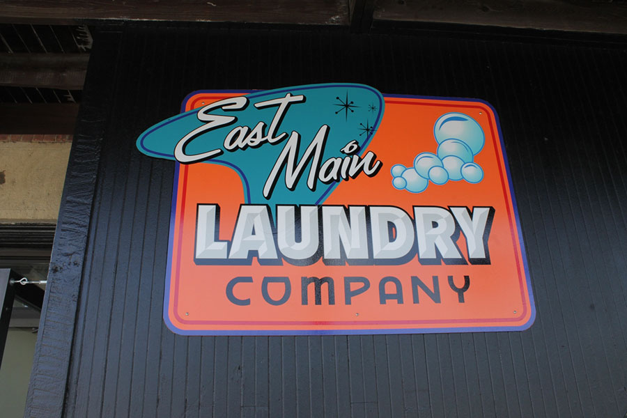
East Main Laundry Company- by Adam Donnelly
The bubble letters with vintage flair and set against retro geometric shapes, gives this sign nostalgia and charm. It makes a statement that the Laundromat is not your typical washer and dryer business. The fun colors are inviting to anyone looking to clean their threads.
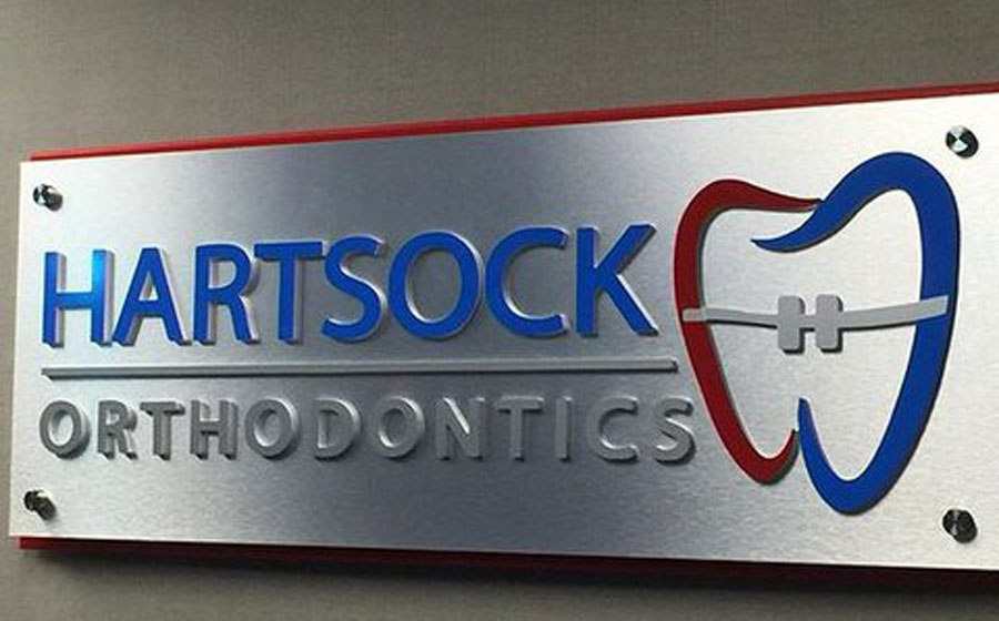
Hartsock Orthodontics- by The Sign Chef
The teeth-straightening dentists are open for business at Hartsock Orthodontics. With a fun graphic of a tooth in a brace, the sign gives a straightforward sign a playful twist. With a signage this cute, who wouldn’t want to get braces?
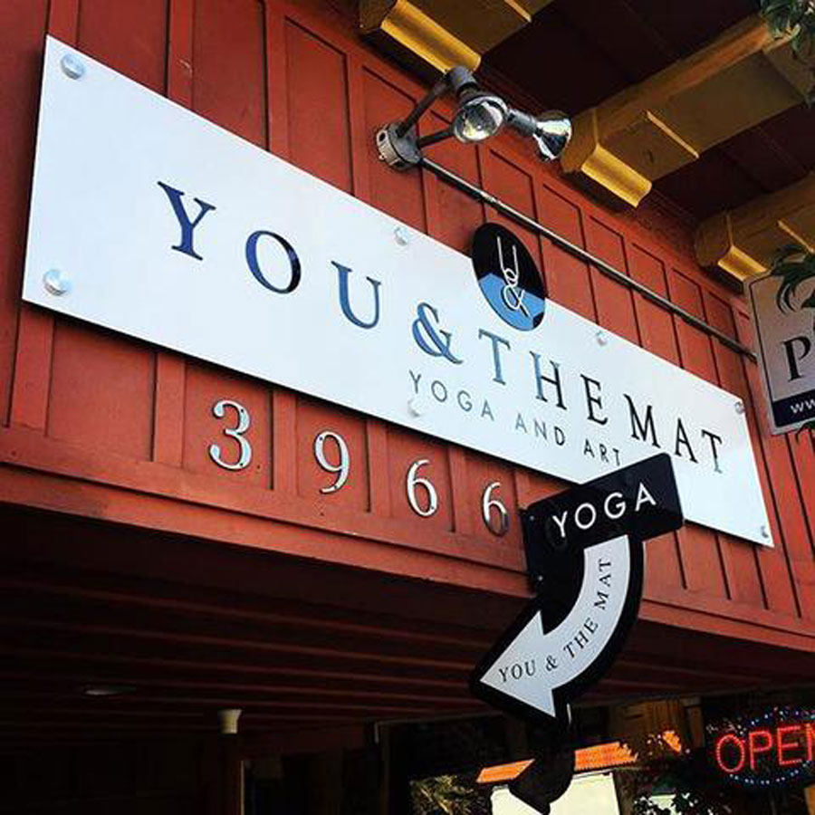
You & The Mat- by Bennett Graphics
Naturally, the signage for a yoga studio looks like a rolled out yoga mat. It’s given a bit of a simplistic vibe with the typeset used and even provides way-finding for where to find your zen. Given that yoga studios are popping up faster than you can say “Namaste”, it’s good to have distinct branding and signage in such a busy market.
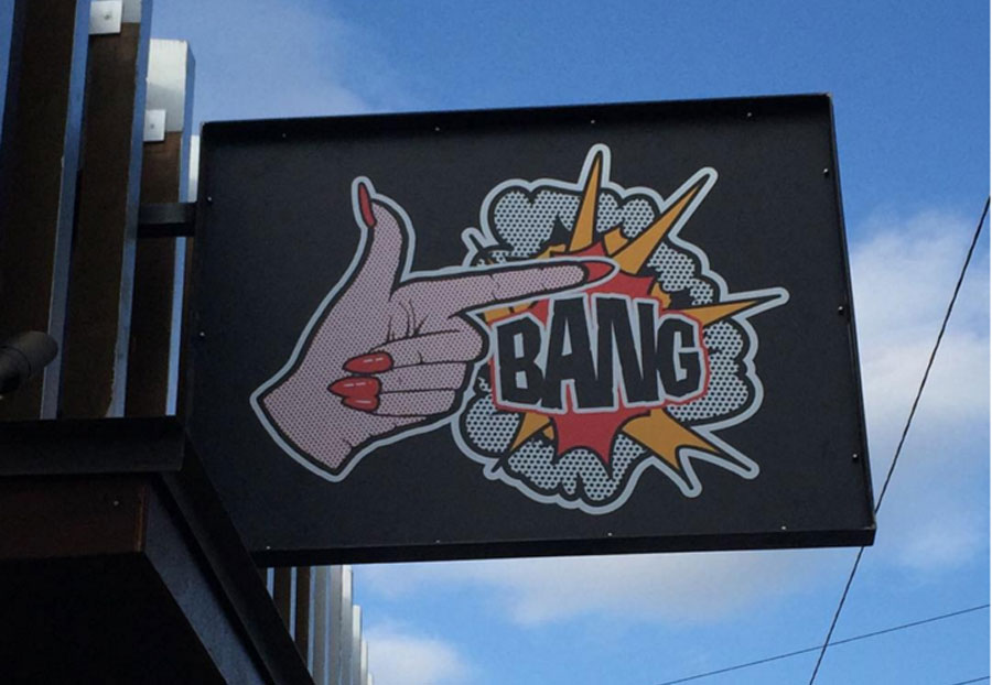
Nail Salon- by Moto GFX
Signage with a hardcore vibe really stands out for a nail salon. Comic book fans can appreciate the unique pixilated imagery for a modern day salon. Durable Dibond is the perfect substrate to hold up to any condition and set the tone for the type of nails this salon offers.
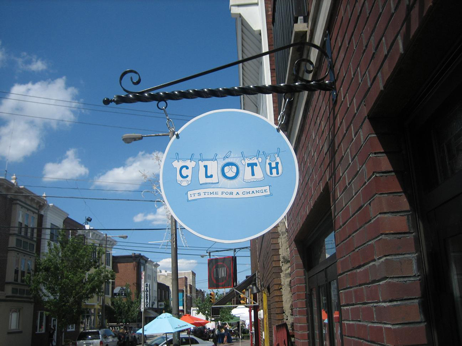
Cloth- by Interior Tech LLC
With such a cute clientele, the baby cloth diaper shop needed a cute sign. The Cloth shop even makes a statement in more ways that one with it’s messaging, “It’s time for a change.” Moms and dads can go in this shop knowing their babies will be eco-friendly with cloth diapers.
Dibond is often chosen for exterior signage for its flatness, printability, rigidity and light weight. Have a project using Dibond aluminum composite material? Don’t forget to share via the hashtag #Dibond on social media!

