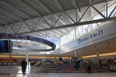
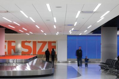
 JetBlue’s JFK terminal T5 was a very important project for the relatively young airline. It was their first terminal in which they had direct input in its planning and design. Architectural and design giant, Gensler, had the extraordinary task of designing a terminal that did not take away from the Saarinen design of the exterior.
With customer experience as the primary goal of the project, the design needed to be easily navigable, aesthetically pleasuring, adhere to strict signage guidelines, and also represent JetBlue in what the company calls “JetBlue-ness.”
JetBlue representatives stated that customer experience is greatly improved when passengers can easily navigate through their terminal.
The Port Authority of New York and New Jersey (PANYNJ) dictates the signage guidelines in terms of colors, type, letter heights and materials.
 Yellow signage is used to specify flight information, black for airport services, green for exits and grey for general information. The purpose of such guidelines is to add consistency within transportation to allow users to navigate more easily.
The ceiling directional’s used a variety of materials including aluminum, Dibond, vinyl and steel, fabricated by MSD Visual. Services available off the concourse, such as elevators and restrooms, were indentified with Sintra board signs in aluminum brackets.
Gensler and JetBlue showcase the ability to represent your brand’s identity with environmental graphics and signage design.
information courtesy of SEGD
photography courtesy of ©David Joseph, Prakesh Patel, Nic Lehoux

